There is a noticeable difference between how the map looks on a computer screen and how the printed version looks. The one on my screen appears to be darker and appears a little dull. The gradient background appears to be darker. If I could make changed, I would make the 14.9% class a little more pink.
Wednesday, October 16, 2013
Sunday, October 13, 2013
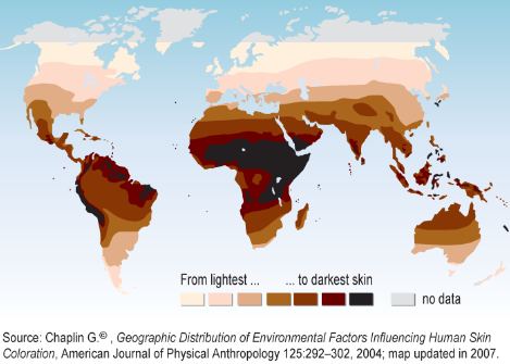
Geography of Skin Color
I thought this was a pretty interesting map. It uses color, but not in the normal "colored map" kind of way. Each color represents the skin color of people in the area.
Sunday, September 29, 2013
Thursday, September 12, 2013
Thursday, September 5, 2013
Subscribe to:
Posts (Atom)